Week 8 - Devlog
After a punctual and much needed break, we're back with yet another new devlog! This means we've reached the second week of the final sprint of production and deadlines are closing in. Rest assured we've kept a steady pace and feel like we will soon reach what we've been working towards! Have a look:
Introduction
A first round of playtesting showed we were going in the right direction, but still needed tweaks in specific areas. For example, the power source gameplay element was missing a coop aspect to it, and as such we've made it a requirement that one player should charge up the power source (and therefore aims it), while at least one other player spins it up. Depending on how fast the power source was spinning as the charging player releases it, the strength of the fling will be more or less powerful.
We playtested again several times thereafter and the main issues we noticed were centered around visibility and map layout/overall balance, which we have taken a look at for this week. Even though the lockdown continues, we haven't relinquished on our efforts so we hope you enjoy the following!
Art & Design
For this week, a lot of attention has been given to the level itself and how it is populated, along with other visual effects. Have a look below!
Level
We have slightly changed the mood of the level in an attempt to increase contrast levels and to be able to guide players further with different kinds of lights. Some other things we focused on were height differences, objects to hide behind and navigation options.
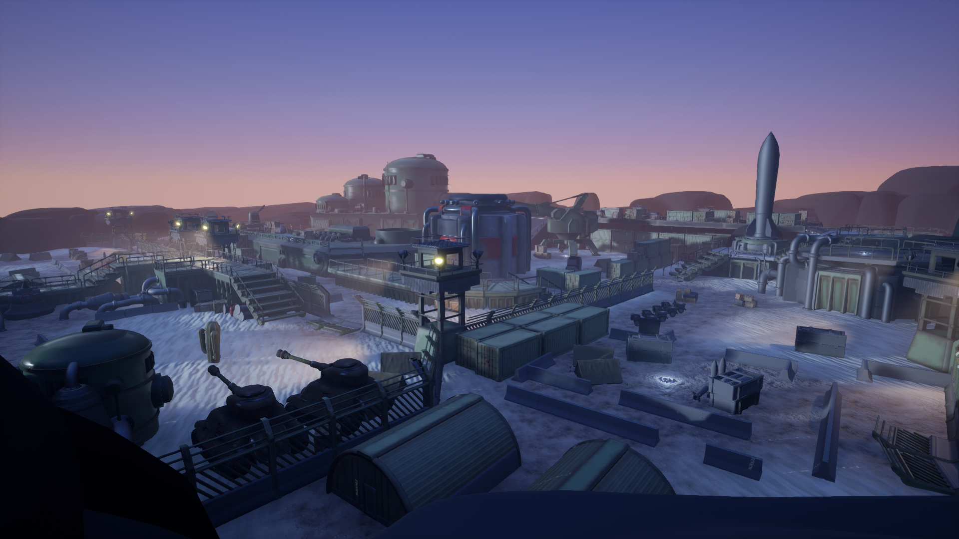
Overall, there are more intertwining paths through the level now, and more spots where UFO parts can appear.
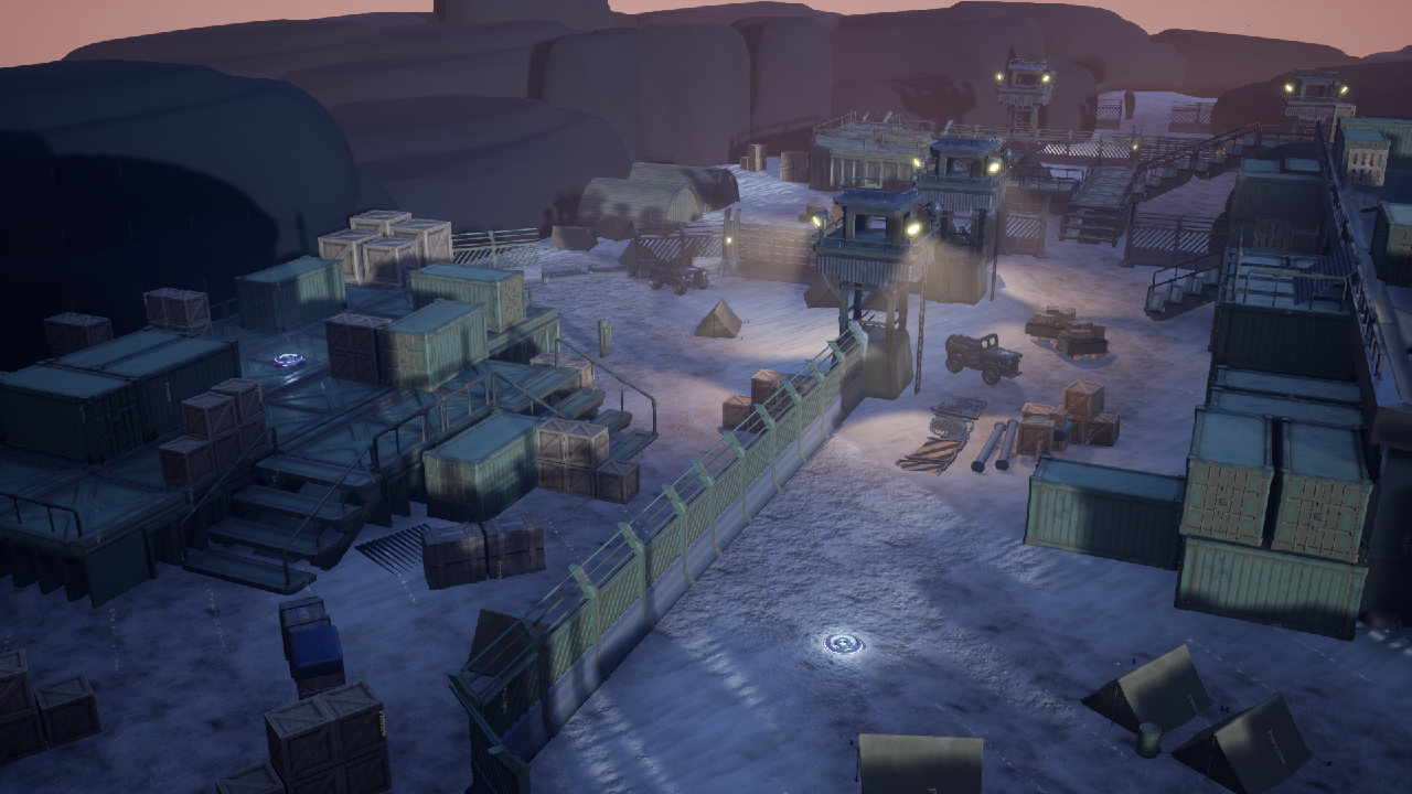
The back of the level has been revised as well, as it previously did not serve much of a purpose. An UFO part may now appear there.

Another view of the back, which shows the access ramp to the bridge.
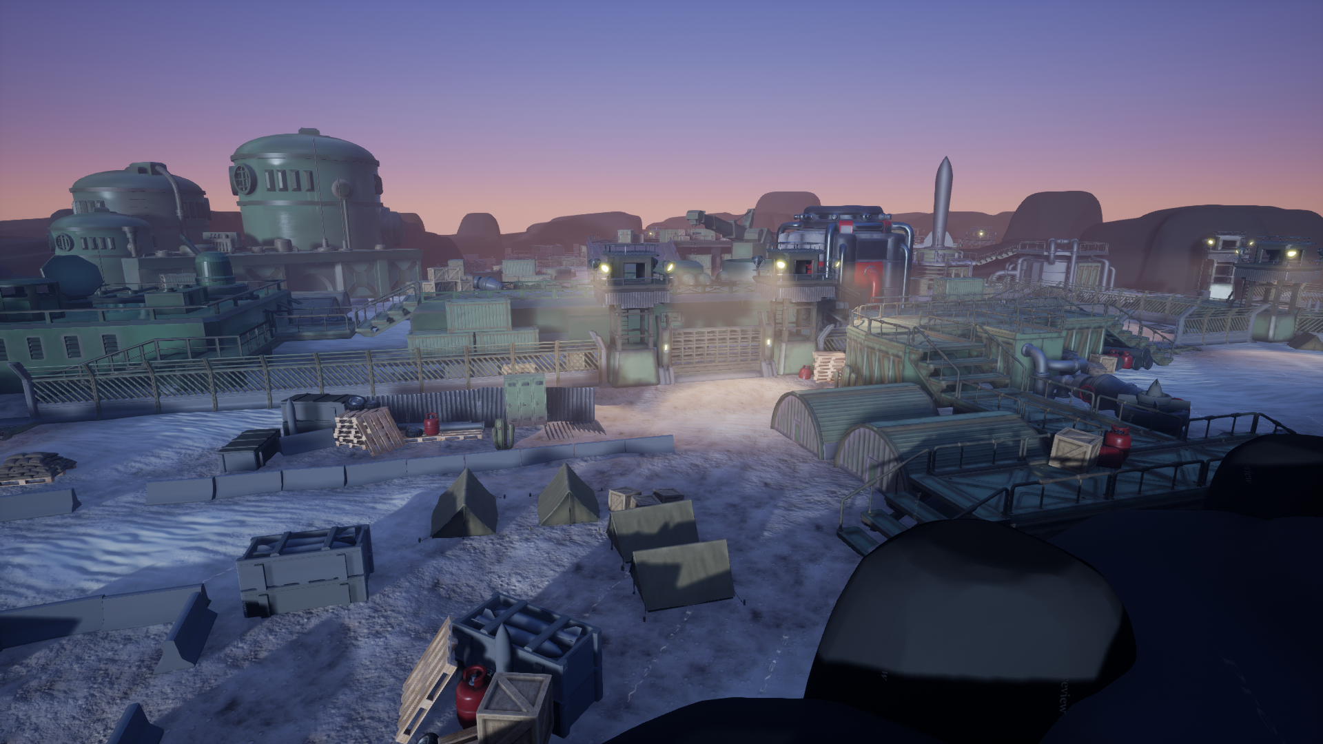
The area at the front of the map has some more navigation options, and the amount of empty open areas has been decreased massively.
Props
Quite a few additional props have been created to populate the level:
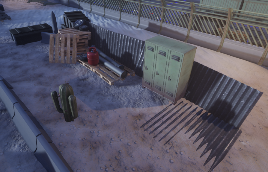
Notice how these can serve as cover or hiding spots.
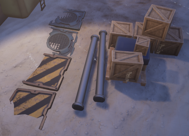
Some more props behind which you can hide.
Buildings & Large Props
Progress has been made on these as well:
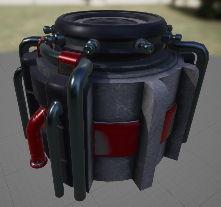
An upgraded generator.
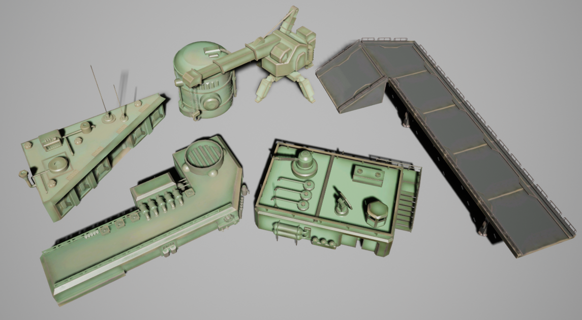
Some early progress on these other large props.
Particles
Existing particle effects have been improved while new ones have been created to give players extra information about what is going on:
Bullet Tracer
Power Source Fling Direction
Power Source Hover
Power Source Collision/Sound Event
Power Source Part Collection
Programming
As previous weeks, we've continued improving existing features and adding new ideas that have come along the way. Progress has been smooth enough and we're confident we'll be able to reach our goals in time. Have a look:
Power Source
Physics Objects
In an effort to make the power source ever more central to our game, we've made it possible for physics objects to be flung around by the power source. Blocking the path of our players right at the beginning with a wall of barrels ensures they understand the game to an acceptable minimal degree to be able to continue.
Soundwave
As you might have noticed, whenever the power source produces a noise event heard by the AI, "soundwaves" will appear at the source of the sound to indicate this.
Coop Flinging
As mentioned before, it is now required for one player to charge up the power source by holding the fling button, while others tap the fling button to spin it up. The final fling power is determined by how fast the power source is spinning when the charging player ends the charge.
Fling Direction Arrows
Whenever a player holds the charge, a directional arrow will show in which direction the power source will be flinged.
Auto-Aim
We've made a few extra adjustments with the auto-aim functionality to allow it to aim towards physics objects, in addition to modifying the default behaviour when a player does not hold the right-stick.
Previously, the power source would aim towards the charging player themselves, but we found out through playtesting that it is sometimes overwhelming to have to keep track of charging, tapping, enemies, your own character and so on... which is why letting go of the right-stick while charging will instead automatically aim towards the closest auto-aim target.
Visibility
Highlighting
Through the usage of a custom depth pass, we've added a highlight to our characters when they're completely out of view to ensure players would never completely lose track of their alien.
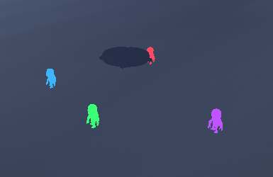
Same for the soldiers, but much more subtle:

Dissolve
Another thing we wanted to take a look at was the dissolve we had already made in the prototyping phase, while upgrading it over our previous version. The main difference is that it is plugged in as a material function to other materials, which preserves the original material, while the previous version replaced materials in real-time. which did not preserve the original material whenthe effect was active. Here's the result:
Camera
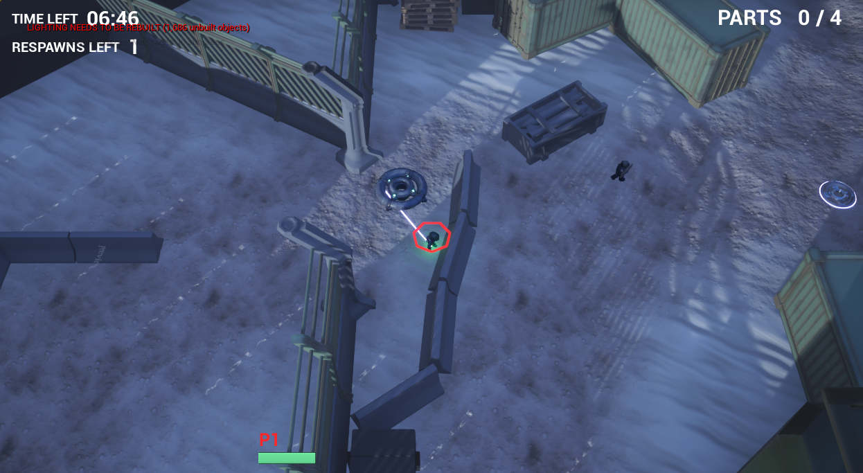
We also wanted to increase how much was visible to players through the camera, while keeping characters at about the same screen size. Here's how things looked like previously:
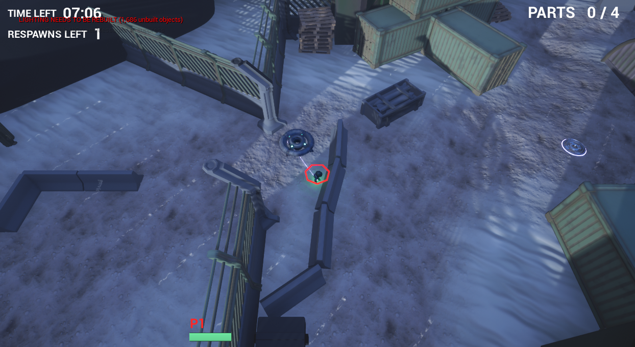
After playing around with settings such as the field of view, the tracking camera's minimum arm length and so on, we came up to the result you see below, which we believe works better during gameplay! It also gives off a different "feel", one more in line with our goals.
Animations
Guard Animations
Guards will now animate while walking and running, and using Unreal's implementation of FABRIK, they will also try to reach with their left hand to a specified spot on the weapon model.
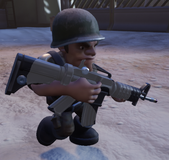
They will also play a shooting animation when attacking:
Alien Animations
First, we added animations for walking in all directions (4way) to our aliens. Depending on where you look, the character will animate accordingly.
After movement, we tackled getting downed. Until a player is revived, they will stay downed on the floor.
Miscellaneous
Pause Menu
There's a pause menu when you press the Start button now:
AI Nodes
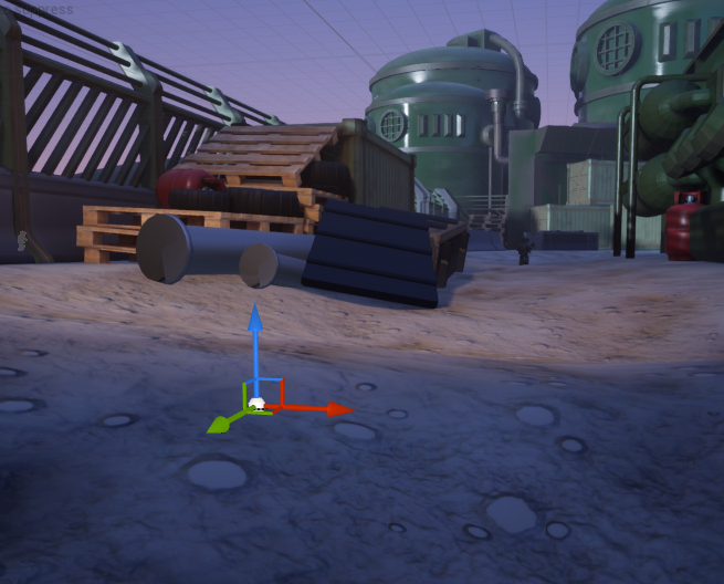
As we've changed from a flat brush terrain to an actual terrain asset, the differences in elevation caused some AI nodes to fail, which would mean guards were not able to move across the map anymore. This was resolved by automatically dropping nodes to the floor as soon as they spawn in the map.
Spawners
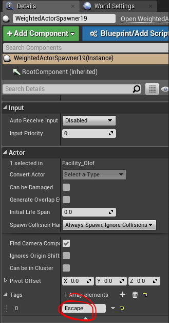
Something we also wanted was extra guards spawning in later on during the game, especially during the escape sequence. As such, we use some tags on the weighted spawners to determine when they should activate.
Balance
We've also applied numerous balance changes in the hopes that they would work towards our vision. For example, guards now have a lower alert scream radius and move slower. The coop tapping/spinning up for the power source was tuned to encourage all players to participate. The velocity thresholds for which the power source causes noise were adjusted. Guards will fly off more dramatically when hit by the power source, and so on...
Conclusion
And that is it for this week! As we're closing in on our final result, you can probably expect more player feedback audiovisuals, some more tweaking and balance changes, menus and so on...
The current version is available now right here! As we've tweaked the mechanics a little bit, here's the current set of controls:
- To move around: Left Stick or WASD
- To look around or aim the power source while charging: Right Stick or Mouse
- To charge the power source (hold button for a maximum of 3-4 seconds) : Right Bumper or Middle Mouse
- To spin up the power source while another player is charging (tap) : Right Bumper or Middle Mouse
See you next week!
Files
Get HIVEMIND
HIVEMIND
A co-op stealth game in which you incarnate aliens invading a highly classified government facility
| Status | Released |
| Authors | simonv, bierset nathan, Olof Aviron-Violet, BavoMispelaere |
| Genre | Action |
| Tags | Aliens, Local Co-Op, Local multiplayer, Multiplayer, Space, Stealth |
| Languages | English |
More posts
- PostmortemMay 24, 2020
- Week 11 - Final DevlogMay 13, 2020
- Week 10 - DevlogMay 06, 2020
- Week 9 - DevlogApr 29, 2020
- Week 7 - DevlogApr 01, 2020
- Week 6 - DevlogMar 25, 2020
- Week 5 - DevlogMar 18, 2020
- Week 4 - DevlogMar 10, 2020
- Week 3 - DevlogMar 03, 2020

Leave a comment
Log in with itch.io to leave a comment.